tdjs.dev projects
2025
Vulgate
An experiment to recreate the look and feel of medieval blackletter manuscripts with HTML & CSS.
https://vulgate.tdjs.dev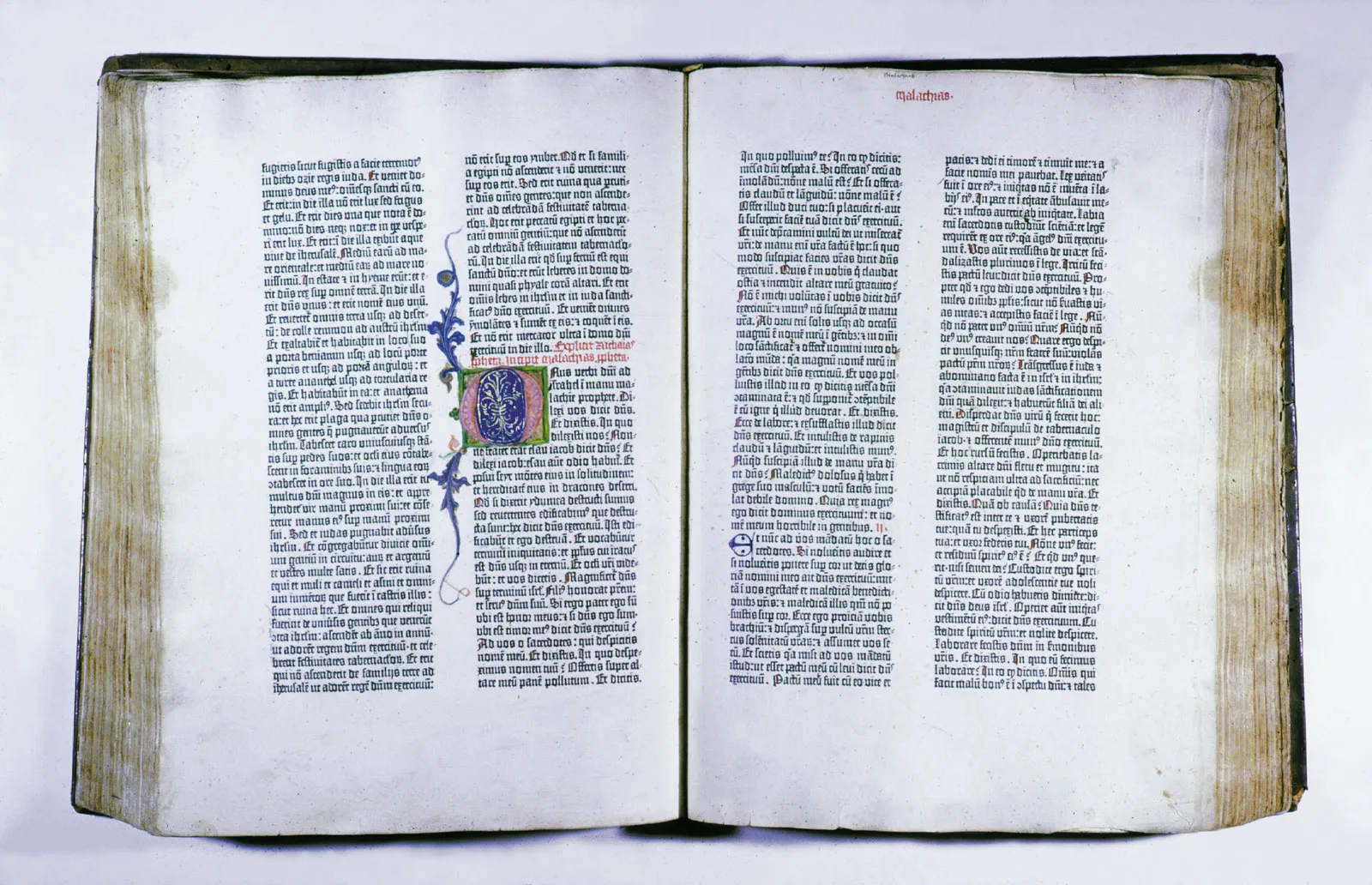
Recently, I have found myself fascinated by the works of art that are illuminated medieval manuscripts.
I thought it would be an interesting project to try and recreate the look and feel of handwritten blackletter in HTML and CSS.
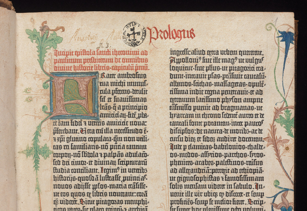
What better example to try to recreate than the Gutenberg Bible? Of course, it was not actually handwritten—being the first mass-produced, printed book in Europe—but it preserves that aesthetic well, and is probably the most well-known example of the style I wished to replicate. Plus, being the Bible, it was easy to find and download the contents.
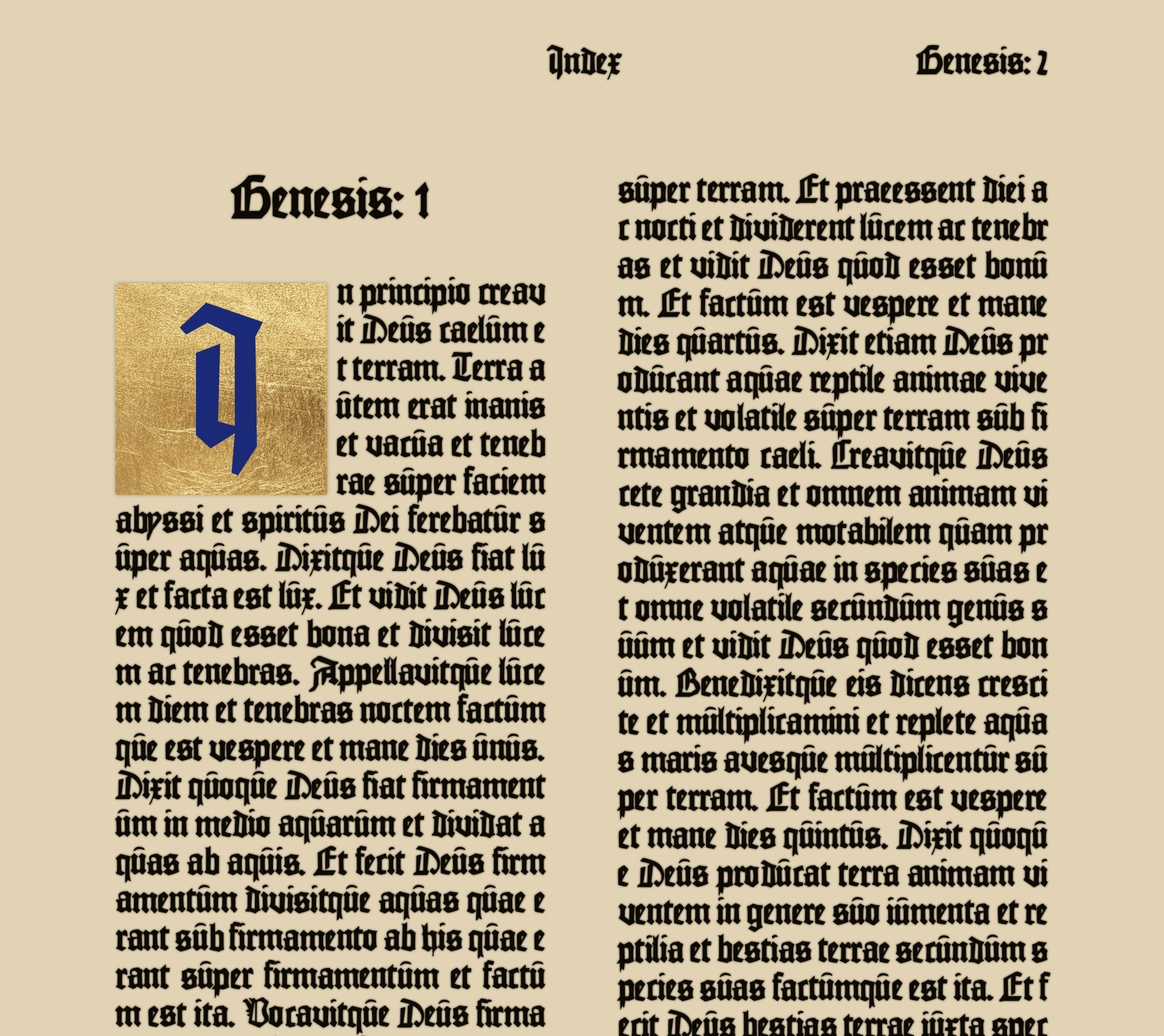
This particular image served as my main source of inspiration:
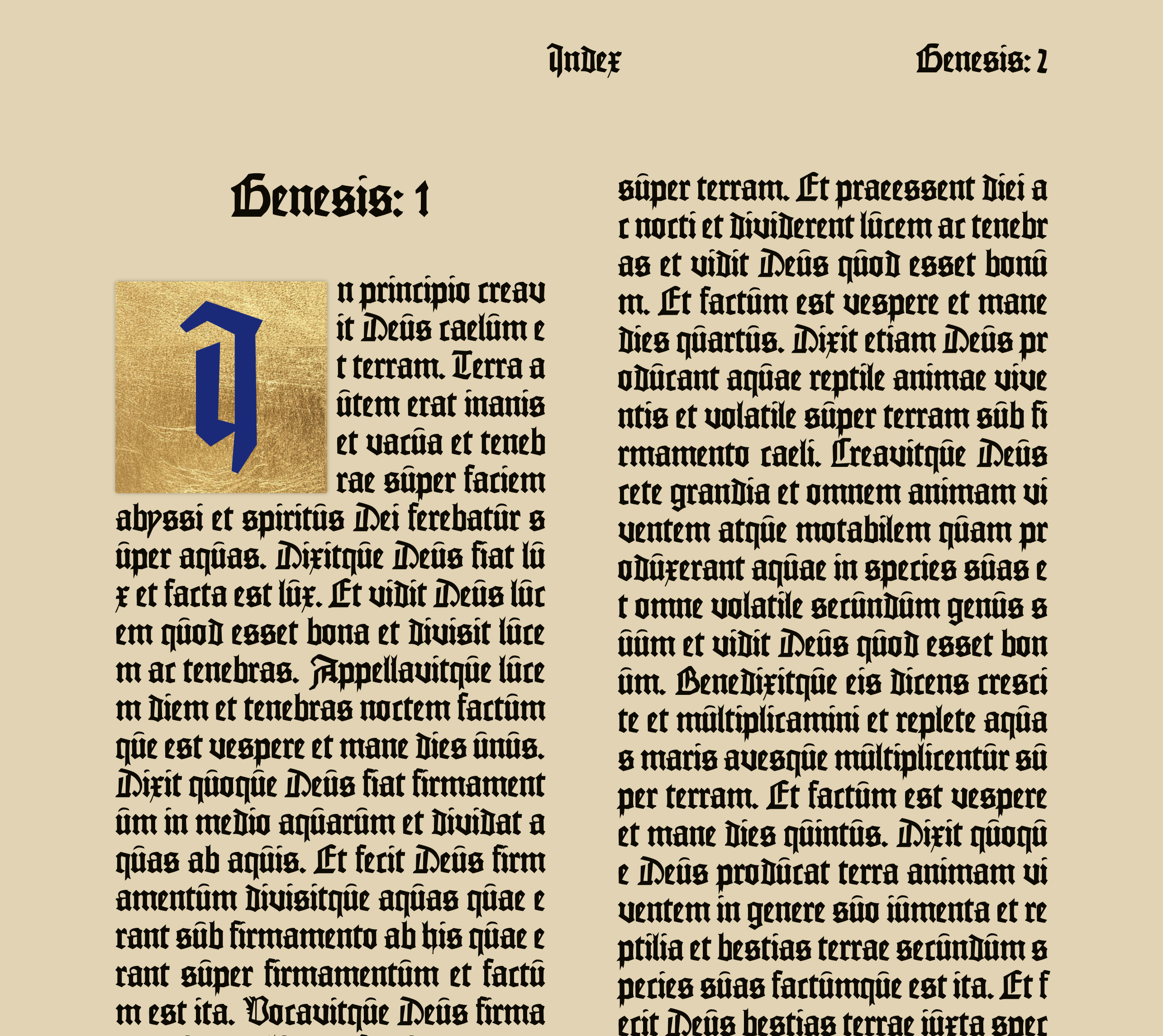
1. The Basics
A couple of justified columns in an appropriate typeface and we should be there, right? As it happens, it takes a lot more than that to produce something that comes across as handwritten, as opposed to text rendered on a screen.
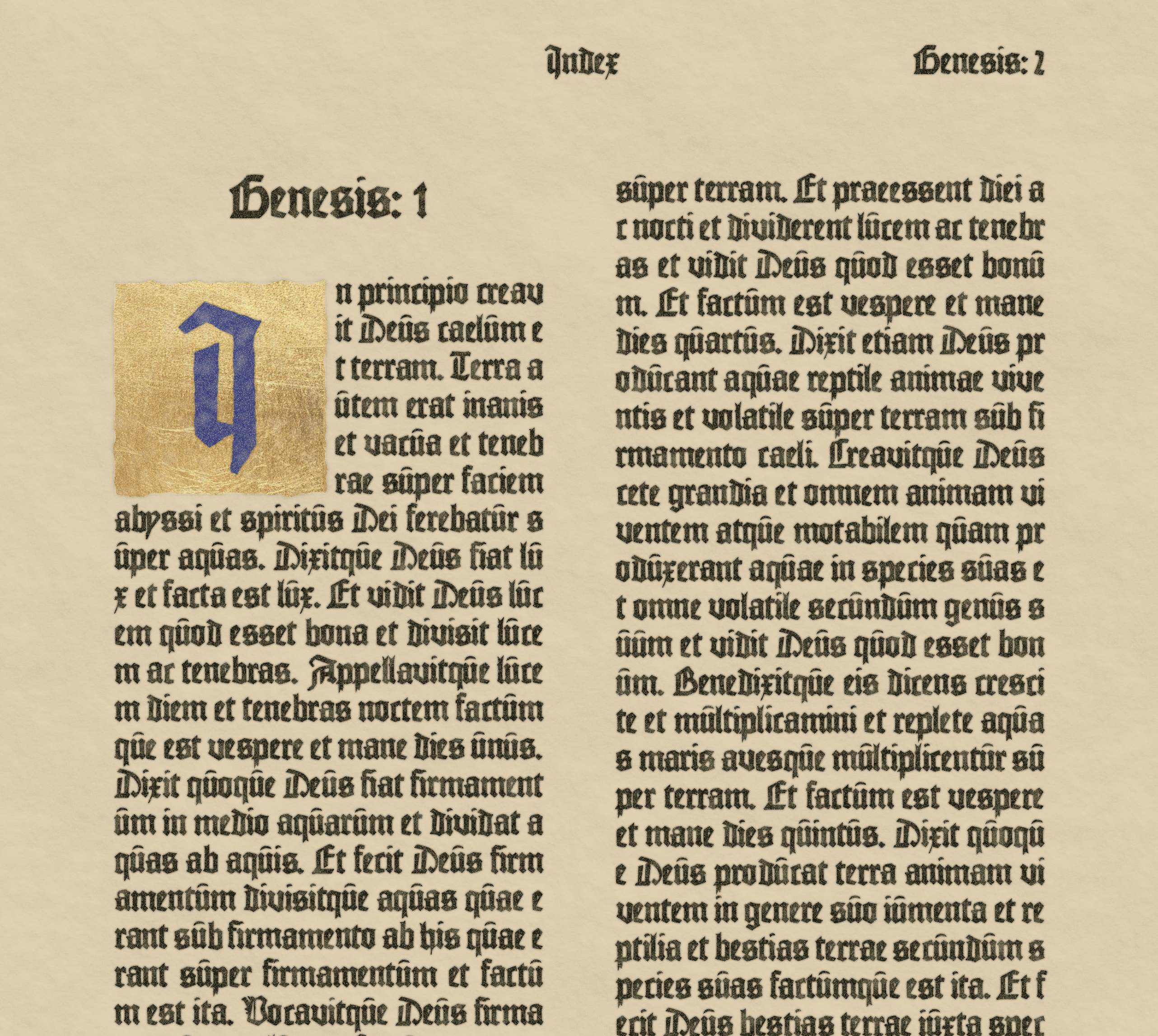
2. Adding Imperfection
The first technique I employed to make things look a little less rigid and uniform was to apply a random rotation and translation to each individual character. These values are only very small, but go a long way in making things look a bit more 'natural' when the page is viewed as a whole.
3. Ink
But the lettering was still very sharp against the background – to combat this, I added a very subtle text shadow to the characters, which gave the impression of ink feathering very slightly as on paper or vellum.
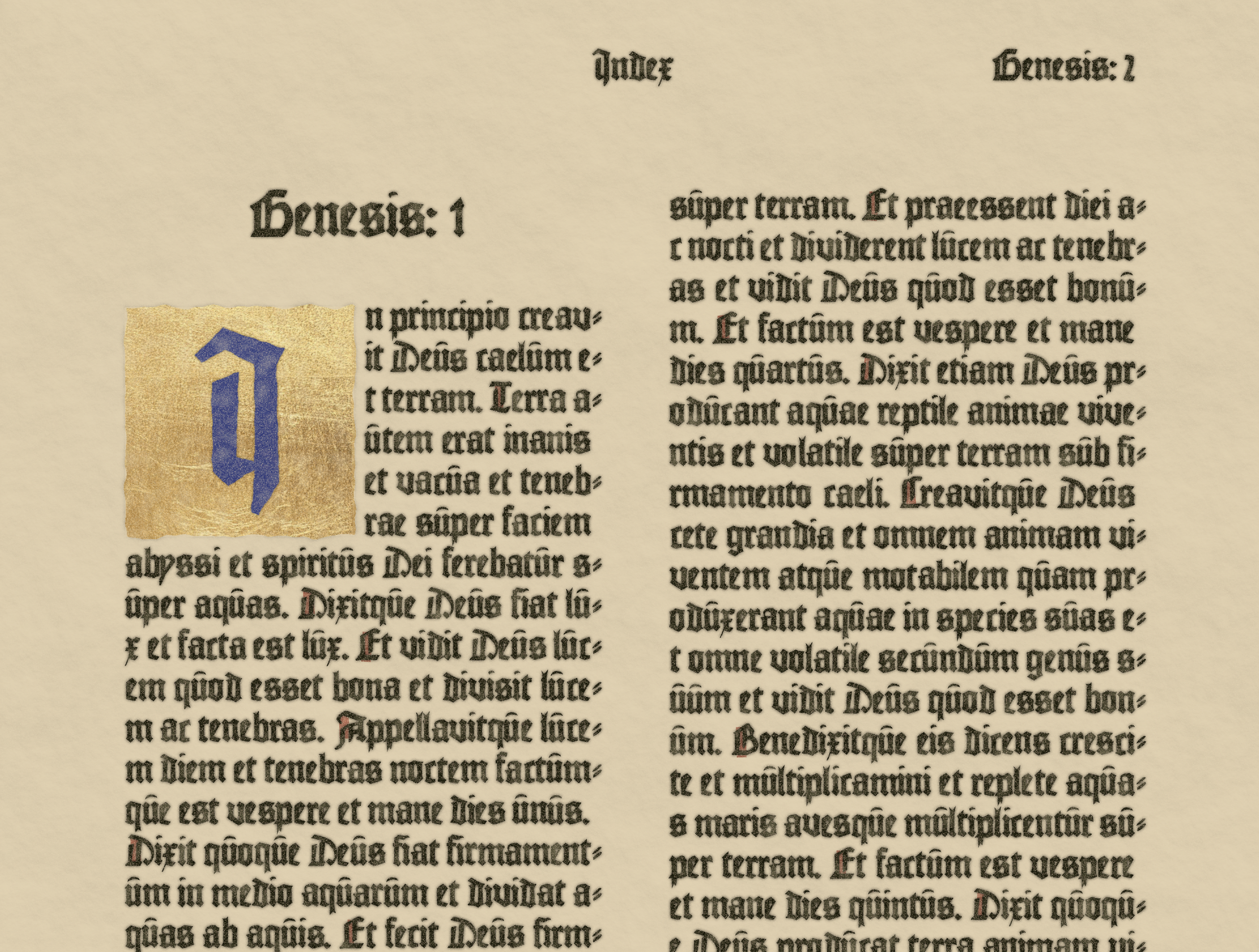
4. SVG Magic
Then, to give the page some 'texture', I applied a number of SVG filters to the background and the text. These were:
- A 'rough paper' filter applied to the background, consisting of
feTurbulence,feDiffuseLighting, andfeDistantLight. This gives the otherwise flat background a feel of textured paper. - A 'grain' filter applied to the body, consisting of
feTurbulence. This gives everything a nice noisy 'imperfect' feel. - An 'ink' filter applied to the body, consisting of
feTurbulenceandfeColorMatrix. This adds varying opacity randomly across the foreground, giving the feeling of ink that has flowed inconsistently from the writing instrument. - Two 'rough edge' filters applied to the chapter initial, consisting of
feTurbulenceandfeDisplacementMap. These add some random distortion to the background and character of the initial, again to make them a little less perfect.
As you can see, these filters go a long way in making everything look less harsh and sharp, and more natural.
The code for the filters can be found here.
5. Marking Capitals
Next, the capital at the beginning of each sentence is marked with a red stroke, as is often seen in manuscripts like the one pictured above. This is done by simply looping over the characters, and adding an extra class name to ones preceded by a full-stop. Again, each of these is given a random rotation and translation.

6. Line Breaks
Finally, while the justification is not as nice as it could be, I think it does fairly well – the line is broken wherever it lands, and words that get broken across lines receive a small 'wrapping indicator' as also seen above. This is done by iterating over the characters, and finding those for which the following character is not a space (i.e. part of the same word) and is also positioned further left than the current character (i.e. wrapped to the start of the next line).
Without smarter justification, wrapping happens more often than I would like, but is something I have had to accept.
With all of these techniques applied, we arrive at something that I hope feels more handwritten than pixel rendered.
While not perfect, I think compared to the original image that served as inspiration, it does look fairly good. Less the wonderful illumination of the initial and in the margins of course.
But please visit and judge for yourself! The source code can be found on GitHub.
Want to get in touch? You can email me at hello@tdjs.dev or message me via X at @tdjsnelling.
You can also check out more work over at GitHub.